Back to cases

Case Study

In-App Registration

ArtStation App Registration

ArtStation has a notoriously rigorous registration process - that’s how we keep the bots out! In our web experience users can browse content without having to create an account, but in our mobile app, for compliance reasons, we had to implement a mandatory sign-in.

With this redesign, we made it easier for new users to enjoy the platform without sacrificing site integrity.

Role

UX Research, UX & UI Design

Team

Ayrat Safiullin, Dmitry Kosarev - Android Development
Chingiz Halikov - QA
Ruslan Gatiyatov - Product Owner

Problems

Our in-app registration drop off rate was very high

We were losing tons of potential users because they couldn’t sign up through the app.

The registration issues were tanking our reviews

Frustrated users who downloaded the app but couldn’t actually use it were (understandably) frustrated, and without any way to get help - voiced their disappointment on the app stores.
About 70% of our 1-2 star reviews were from people who could not sign up.

A few real user reviews

Why couldn’t we just get rid of the sign-up?

A while back, the ArtStation app did allow users to browse as soon as they downloaded the app, but in late 2018 SESTA/FOSTA legislation changed the way platforms were required to moderate content and we started having problems with the app stores (you can read all about it in this article our CEO wrote when it happened.)

To solve the issue ASAP we made signing-in mandatory. Every user who was looking at art through the app had to confirm that they were at least 18 years old during the registration process.

It worked! We got reinstated, but because we had to act fast the registration flow wasn’t adapted and the user experience suffered.

Usability Testing & Research

Quantitative

Google Analytics
We looked at registration funnel data to figure out where we were losing users. Our 10-step funnel tracked the entire onboarding flow, from download to completed registration.
Identifying the culprit screen
We were losing more than half of our potential users on the verification screen. This part of the sign-up required users to verify their account by receiving a confirmation code or connecting a social media profile.

Qualitative

Store Reviews
We read through every single review on the Apple App Store and Google Play. This helped us determine the severity of specific issues within the registration process.
1st-Time-User Interviews
We recruited a few users who had never signed up through the app (fresh take) to walk us through the process. Using their first-hand experiences, we constructed user stories to keep in mind while brainstorming solutions.

Trying to sign up using the app

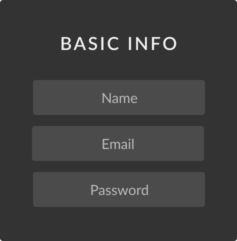
Too Much Info Upfront

We were making users (many of who had never seen ArtStation before) give us their phone number or social media account information.

Sooooo many fields to fill out

Right off the bat, we were asking users (who, again, had JUST downloaded the app) to enter tons of arbitrary account information.

parts of the process kept breaking

Sometimes the email confirmation wouldn’t send, occasionally the timezone field wouldn’t accept the selected option, and often the verification SMS never arrived - stranding users on a screen, unable to complete registration.

Solutions

A more “basic” user state

The user creates an account but does not need to confirm their email, verify their identity, or fill out profile information until they try to upload or interact with content.

Automate, auto-fill, and clarify the verification form

We want users to complete, confirm, and verify their account as fast as possible so we “optimized” the form by auto-filling some fields and thoroughly explaining requirements on others.

Technical Challenge: No backend changes allowed

Historically, our mobile app team did not have a backend developer so the app devs worked with other teams if they needed API changes. This time around, all of the other teams were busy with high-priority features and couldn’t take time out of their sprint to reorganize the registration for us.

Additionally, our management and security teams explained that we couldn’t really "get rid of" any registration steps because ArtStation’s site integrity would be at risk (i.e. a bot-ridden hellfire with untrustworthy project rankings messing up the whole experience.)

We challenged ourselves not to touch the backend at all and rebuild the new registration by reorganizing the steps (so - the order in which we sent requests to the backend, but not the functionality of the steps themselves.)

Reorganizing the registration steps

To simplify the user flow, we created a more “basic” initial account and pushed the full registration down the line, requiring it only if/when a user wants to engage with content and other users.

Old Registration

New Registration

Simplified user state

Why should users need to verify their account just to look at art? They aren't a security risk until they start sending requests to the backend (liking, commenting, posting).

To let users settle into the app we created an additional user state, one where the new user’s account is created but not completed, confirmed, or verified. We still make sure that the user is of age and accepts the Terms of Service and Privacy Policy, but let them explore freely without committing any more of their time until they are ready to join the community.

Actions trigger full registration

If a user with a “basic” account state tries to like, comment, upload, add to collection, message, or follow -  they are shown a pop-up asking them to complete their account registration.

The registration asks new users to confirm their email, verify their identity through an SMS code or a social media account, and fill out their profile with information like “location” and “professional headline”.

If a user doesn’t want to confirm and verify their account they can leave the process on any screen and go back to browsing the app, but as soon as they try to like another project they are again asked to verify their account.

Goal Oriented UI

To create an account, our backend requires a set of fields (Name, Username, Professional Headline, etc.) to be sent over from the frontend. When building the new registration we re-examined every part of this form and its format.

Does a user really need to fill this field out? Can we do it for them? If their input is required can we help them do it correctly on the first try?
Material Design Components
We designed the user registration interfaces for Android using Google’s Material Design component library and guidelines, keeping with the decision to use mostly native components for each platform (see the app redesign). The outlined text inputs worked well, keeping the registration clean yet informative.

Text Inputs with hints and inline validation

This type of field requires the user to manually type.
The goal here is to inform the user of exactly what we want from them.

Auto-generated editable fields

This kind of field is generated out of view from the user,
typically taken from an input that the user has already filled.

Auto-Filled fields and Searchable dropdowns

We fill in a user’s information automatically when we can.
As with the auto-generated fields, if a user doesn’t want to use the auto-filled information - they can easily change it.

Quickfix! Contact support easily

As much as we would love to predict every possible issue that can arise during registration, it ’s a complex process... so we can’t. We decided that providing easy access to support is the next best solution.

Once the user begins confirming/verifying their account they are shown a “contact support” link at the bottom of every screen. Clicking this link opens an email with a pre-drafted support ticket subject line. Our 24/7 support team sorts out whatever is going wrong, and the user, now part of our community, can go back to the fun stuff - looking at art!

Results

Our insane drop-off rate was the whole reason we decided to prioritize the registration redesign. Before the release of this new flow, the monthly average for a completed sign up wavered between 4 and 6%! This meant that we were losing almost all of our potential users who tried to create an account via the app (we knew that some of them just signed up through the website) but still, this number was horrific.

2 months after the release of the simplified registration process, 76.3% of new app users were signing up for a “simplified” account.

Out of those who  went on to the “full” registration process, 54.2%  confirmed and verified their accounts.

This really does demonstrate that user intent is important. When we let a user explore the app a bit before giving them the option to verify, they are much more prepared, informed, and likely to go through with it.

What i learned

This new registration project confirmed my reasoning for the big app redesign that we worked on and released about a month prior. The dev team knew why I was designing the way I was and I knew how their code worked (e.g. I could discuss which frontend requests should trigger the Complete your account pop-up because I know how events work in the apps).

We felt an unprecedented ease when communicating with each other, and ended up creating something great because of it.

The self-imposed ban on backend changes forced me to innovate and come up with user-flows that I otherwise wouldn’t have because I could just go ask my backend devs to restructure their code to fit whatever I made up. Not having that opportunity was a great exercise in creative problem solving.
Asset credit: Jaemin Kim, Scott Gadille, Michal Motulewicz, Florent Auguy, Tomas Honz, Benjamin Bardou, Ivan Solyaev, DOFRESH, Riyahd Casseim, Jan Urschel

Next Case

Mobile App Redesign

 Back to Project Index