Back to cases

Case Study

Checkout

Redesigning the Checkout

ArtStation enables artists to monetize their work by selling digital goods (like brushes, remade 3D assets, and tutorials) to other artists.

In early 2019 we released ArtStation Prints, which gave artists the opportunity to create and sell high-quality prints of their art (to read up on that, check out my Prints case).

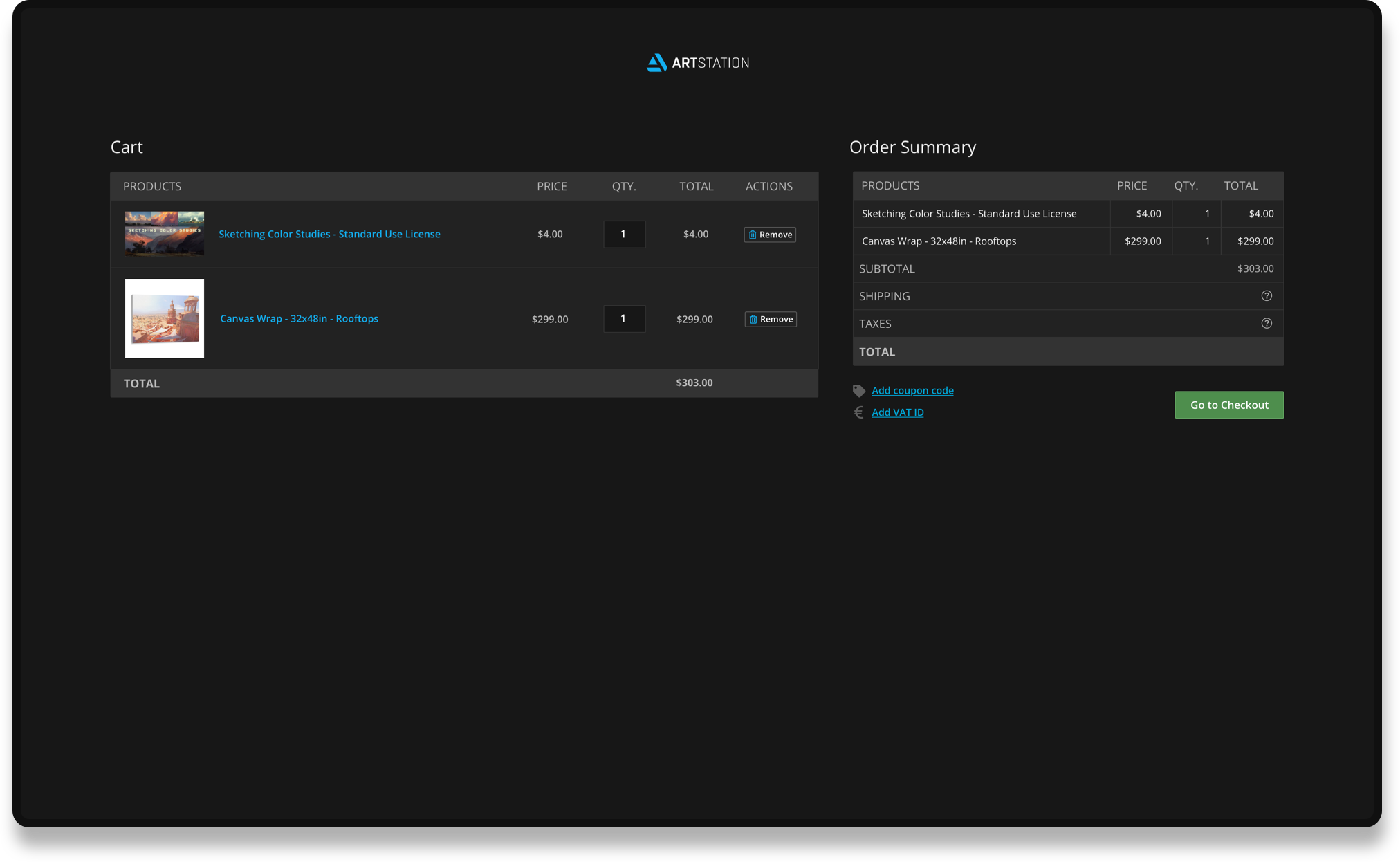
The existing ArtStation checkout form hadn’t changed since the digital marketplace was released. It was in need of a general UX revamp and had to work seamlessly with physical goods.

Role

UX Research, UX & UI Design, Product Architecture

Team

Artem Budiansky - Frontend Development
Oleg Potapov, Evgeniy Petrov - Backend Development
Serhii Korol - QA

Process & Products

Issues
Redesign
Results

Basic Checkout Flow

Product Page

Cart

Checkout

Confirmation

What was wrong with the
existing checkout?

Order summary out of sight

Buyers had to scroll back up after adding their address and selecting a delivery method to see changes to their total order price. Unexpected overcharge waiting to happen.

Inadequate form feedback

Buyers had to submit the entire form to see any kind of error. Our fulfiller validated every address individually, so A LOT of buyers were seeing an "invalid address" response with no suggestions or solutions.  

Can’t save payment info

Our system didn't allow users to save billing or shipping info in their account, so each time they came back to purchase something else they had to re-enter all of it (yep, every address, every card).

User Journey

SO How are we going to fix it?

Add an address validation framework to the shipping form
Write informative error messages for every possible case
Rework the checkout layout to show the order summary change as the user enters info
Design informative product previews for the cart
Let users save shipping and payment information to reuse
Create a thorough tracking process for physical goods
(part of my Prints case)

Checkout Structure

Cart

Checkout

Confirmation

UX Fixes

Shipping address validation

The fulfiller that we work with has a strict format for addresses. If an address that we send with an order is flagged as "invalid", the order is put on hold and the situation has to be resolved manually.

This creates unnecessary "manual labor" for our support team and makes the buyer wait even longer to receive their print.

We created a flow that checks the customer’s address against our fulfiller’s database as soon as they enter it. If the address is entered in the correct format, the buyer isn’t notified in any way, if it isn't - they see a pop-up modal that provides a suggested address or gives them the option to edit their previously entered address.

Saved payment and shipping information

The existing checkout didn’t let users save shipping or payment information, forcing them to reenter their entire card each time they checked out. We knew that most of our buyers were return buyers, so this was especially frustrating.

From the outset, we wanted to strike a balance between creating a low-friction experience and making sure users had full control of their data.

If a user had opted-in to save their information, that payment method and shipping address were selected by default. The user could essentially complete a 1-step checkout. They could also edit their saved info within the checkout without having to navigate to their settings.

Error messages for…everything!

Soooo many things can go wrong  while a buyer is trying to check out.

From invalid payment details and blocked cards to the infamous “oops… something went wrong on our end (but we have no idea what exactly)!”

To prevent buyers from rage-abandoning the checkout, we created an exhaustive list of errors with specific instructions for resolving the situation (including a link to contact support if all else fails.)

Checkout in Action

Flexible Use Form Fields

Redesigning the checkout for our current buyers was the goal, but we wanted to be proactive and build components that would work well with future features. We couldn’t predict all of the possible use cases for the new form elements so we focused on making the design and code as generalized as possible.

Results

We released the entire checkout in one sprint (shout out to Artem, the fastest frontend developer ever) and spent the first week post-release fixing bugs. But right from the start, we could see that the new design was doing what we wanted it to.

The checkout completion rate grew by 12.8% in the first three months.58% of buyers choose to save their delivery and/or payment information, this has brought the average checkout time down by roughly 30%.48.3% of purchases are now made by return buyers.

Our support requests are surprisingly low for an e-commerce platform, giving our wonderful support team, more time to deal with other parts of the website not working. :)

Overall: less scrolling, less typing, more shopping.

What i learned

While designing the new checkout, I tried to create something that could grow and change with the product. Instead of trying to predict the future, I focused on making design elements that are “content-independent” and accommodate a range of user experiences.

Working on this redesign sparked my obsession with writing clear and instructive error messages. As a designer, they're the only safeguard you have for maintaining a great user experience even when something goes wrong that’s out of your control (code bugs, payment failures, server errors, etc.)

Next Case

Prints

 Back to Project Index